Читайте также:
|
The table below describes percentages of home schooled students in SomeCountry in 1999-2004.
The main trend is that all grades including kindergarten is growing for every year. Kindergarten started highest at 2.4 and ended highest at 2.9 percent with a constant increase. But grades 1-2 and grades 5-6 shows a little different trend, both starts at 1,5 percent in 1999 and declines a little bit in 2000. Both of them increased slowly in 2002 and both hold that course to 2004 where grades 1-2 ends at 2,1 percent and grades 5-6 ends at 2.6 percent.
Grades 3-4 have a slow but steady growth through all six years. It starts at 1.6 percent in 1999 and increases 0.1 every year except in 2003 when it peaks up 0.2 percent. Grades 7-8 starts at 1.6 percent and stays there for three years until it rapidly rises up to 2.2 and peaks at 2.5 in 2004.
Overall, all grades including kindergarten has had a rise at roughly minimum 1 percent and more in 6 years.
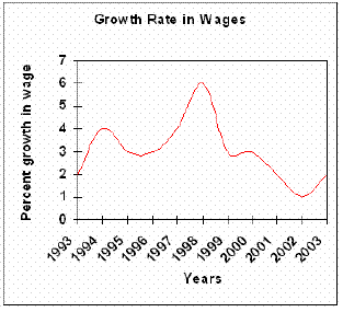
The graph below gives information on wages of Somecountry over a ten-year period. Write a report for a university tutor describing the information shown.

The line graph describes the growth of wages in Somecountry from year 1993 to year 2003.
The growth started at two percent in 1993, but it didn’t stay there very long before it rapidly doubled in 1994. Further on, the percentages declines to three percent in 1995, stayed steady for year, before starting to rise slowly and ending up just under four percent in 1997. 1998 was the best year where the wages peaked at six percent.
However, after 1998 the wages declined nearly every year. Only a year after, the percentage dropped to three percent, stayed there on roughly three percent till 2000. In 2002 the wages reached the lowest point of just one percent growth. Luckily the growth rose in 2003 at just under two percent.
Overal l, the growth rate in wages in Somecountry has shown striking changes through the ten years.
3. The graph below shows annual water usage (in millions of cubic meters) by industries in Somecountry. Write a report for a university tutor describing the information shown.

The bar graph describes the water usage for every year in Somecountry in millions of cubic meters.
The water usage is shown in two trends, ground water and public supply. Fuel and textiles are the ones that use the least water, 10 of public supply and 70 and 80 of ground water. Machinery is just the opposite of these two and has 10 of ground water and 100 of public supply.
Food/drinks, metal, paper and chemicals are all over 100 of ground water where chemicals peak at dramatically 430. The highest number of water usage of public supplies also belongs to chemicals (240). Next on the list is food/drinks with 190, the others are under 100.
Overall, the chemical industry uses a lot more water then the rest of the industries in terms of both ground water and public supplies, and in general most industries use ground water by far more than public supplies.
Дата добавления: 2015-10-21; просмотров: 172 | Нарушение авторских прав
| <== предыдущая страница | | | следующая страница ==> |
| References | | | Working of the Project |