|
Читайте также: |
Describing a Graph Over Time
The bar chart shows the number of times per week (in 1000s), over five weeks, that three computer packages were downloaded from the internet.
Summarize the information by selecting and reporting the main features and make comparisons where relevant. 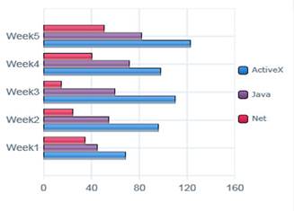
The bar chart illustrates the download rate per week of ActiveX, Java and Net computer packages over a period of five weeks. It can clearly be seen that ActiveX was the most popular computer package to download, whilst Net was the least popular of the three.
To begin, ActiveX and Java showed a similar pattern, with both gradually increasing from week 1 to week 5. However, the purchases of Active X remained significantly higher than for the other product over this time frame. In week 1, purchases of ActiveX stood at around 75,000, while those for Java were about 30,000 lower. With the exception of a slight fall in week 4, downloading of ActiveX kept rising until it reached a peak in the final week of just over 120,000. Java also increased at a steady rate, finishing the period at 80,000.
The product that was downloaded the least was Net. This began at slightly under 40,000, and, in contrast to the other two products, fell over the next two weeks to reach a low of approximately 25,000. It then increased sharply over the following two weeks to finish at about 50,000, which was well below that of ActiveX.
| The following bar chart shows the different modes of transport used to travel to and from work in one European city in 1960, 1980 and 2000. | The chart shows components of GDP in the UK from 1992 to 2000. |


Describing a Pie Chart
The pie charts show the main reasons for migration to and from the UK in 2007.
Summarize the information by selecting and reporting the main features and make comparisons where relevant.

The pie charts illustrate the primary reasons that people came to and left the UK in 2007. At first glance it is clear that the main factor influencing this decision was employment.
Having a definite job accounted for 30 per cent of immigration to the UK, and this figure was very similar for emigration, at 29 %. A large number of people, 22 %, also emigrated because they were looking for a job, though the proportion of people entering the UK for this purpose was noticeably lower at less than a fifth.
Another major factor influencing a move to the UK was for formal study, with over a quarter of people immigrating for this reason. However, interestingly, only a small minority, 4 %, left for this.
The proportions of those moving to join a family member were quite similar for immigration and emigration, at 15 % and 13 % respectively. Although a significant number of people (32 %) gave ‘other’ reasons or did not give a reason why they emigrated, this accounted for only 17 % with regards to immigration.
Дата добавления: 2015-10-26; просмотров: 173 | Нарушение авторских прав
| <== предыдущая страница | | | следующая страница ==> |
| Заправочная станция на Улице Радуги | | | Complete these sentences in a suitable way. More than one answer may be possible. |