Читайте также:
|
In a previous week we looked at key language to describe change through time and to make
comparisons. Look at the first chart and complete the sentences describing the data.
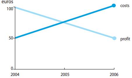
Between 2004 and 2006, costs (1) _______ dramatically, (2) ________ 50 euros to 100
euros.
There was a sharp (3) ________ in profit, which fell from 100 euros to 50 euros over the
same (4) _________.
By 2006, costs were (5) ________ as high as profit.
Spotting important trends and making connections
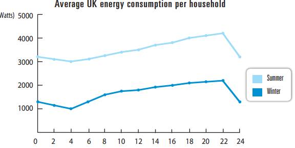
Often you will be asked to describe and compare information from more than one char t. When you do this it is important to analyse any connections between the data that is presented. Look at the second set of graphs, and then read the first sample answer.
Sample answer one
The two graphs show energy consumption in the UK. The first chart shows energy consumption throughout the entire day in households in the winter and summer. In the winter, energy
consumption is about 3200 watts at midnight. Over the next four hours it falls about 200 watts
and then rises to a high point of 4200 watts at about 10pm. Consumption then falls dramatically
back to 3200 watts at midnight.
In the summer, energy consumption is about 1300 watts at midnight. It falls to 1000 watts at
4am and rises dramatically to 1600 watts at 8am. It then rises slowly to a peak of 2200 watts at
10pm
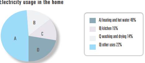
If we look at the pie chart, we can see that heating and hot water use 49 percent of household
electricity. Another 15 percent of electricity is used in the kitchen, washing and drying account
for 14 percent of usage and 22 percent of electricity is used for other things.
In conclusion, we can see that people in the UK use a lot of electricity in the home.
Words
This answer describes all the data, but the writer has failed to highlight the key points or make any
conclusions. Also, by repeating numbers and keywords from the graphs, the writer hasn’t shown that he or
she understands what the data means. Before you write, you need to analyse the data.
6. In the line graph, what is the main difference between winter and summer usage?
7. What similarities are there throughout the day at the two times of the year?
8. What uses more electricity in the home than anything else?
9. What is the connection between the data in the two graphs?
Дата добавления: 2015-10-26; просмотров: 181 | Нарушение авторских прав
| <== предыдущая страница | | | следующая страница ==> |
| B Read the text again and complete the graphs. Fill in | | | Presenting a graph |