Читайте также:
|
An Example of a Graph Description

Good morning, ladies and gentlemen, and welcome to my presentation of Schein Ltd’s sales in the year 2011. As you can see, 2011 was a rather turbulent year for us, with a lot of ups and downs. After launching our product, there was a gradual rise in sales in January from zero to just under 2000. Following a slight fall in February, we commenced an advertising campaign, which resulted in sales rocketing by 8000 from around to a peak of just under 10000. There was a small decrease at the end of March before the sales levelled off and remained constant throughout April and May. In July sales dipped to approximately 7000, but improved in late August to reach 8000. Unfortunately, sales plummeted, dropping dramatically between September and October by 7000 units, bottoming out and hitting a year low of 1000. Luckily, sales began to recover, albeit unsteadily, and with frequent fluctuation. In late December the sales stood at 4000, and now the good news is: it looks as if we’ll avoid bankruptcy.
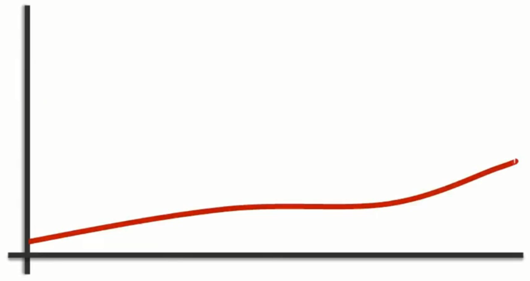
Describe the Graph

_________________________________________
_________________________________________
_________________________________________
_________________________________________
_________________________________________
_________________________________________
_________________________________________
_________________________________________
_________________________________________
Describe these graphs
| 
|

| 
|

| 
|
|
An Example of a Graph Description

The above line graph shows sale of trucks in Petrie during the last decade. During first three years the number of trucks sold remained steady to 200000. After that the figure rose steadily and the sale point reached 450000. A gradual decline was noticed during year 1989 dropping sales up to 300000. Due to the high demand of the market, a dramatic incline was noticed as the sale point sky rocketed up to 900,000 in 1991. As the demand decreased a gradual decline was seen during next two and half years dropping truck sales to 400000 by year 1994 which remained constant for a year and a half. During the last few months of 1995 the sales plunged down to 200000 and remained constant up till 1998.
An Example of a Graph Description
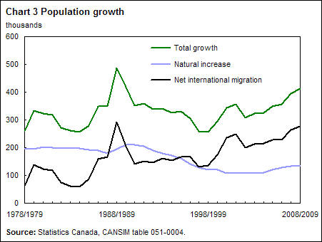
This graph shows the growth of the population in Canada from 1978 to 2009. It is taken from the website about Statistics in Canada.
There are three graphs in the chart. The green graph shows the total growth of the population, the black one deals with the migrated people in Canada and the blue graph shows the natural i ncrease of the population. In 1988/89 there was an enormous growth. In the following years the total growth went down to about 250,000 in 1998/99. From that time on the Canadian population has been gradually growing again although the natural i ncrease slows down. So we can say that the growth of the population in Canada is based on migration.
Дата добавления: 2015-10-31; просмотров: 287 | Нарушение авторских прав
| <== предыдущая страница | | | следующая страница ==> |
| The Vocabulary of Numbers | | | The sales fell steeply – There was a steep fall in the sales |