|
Читайте также: |
Lecture 21. Using list and combo boxes
There are four data controls that provide data-aware versions of standard list box and combo box controls. These useful controls provide the user with a set of default data values to choose from at run time.
Note These components can be linked only to TTable components. They do not work with TQuery components.
The following table describes these controls:
Table 4.5 Data-aware list box and combo box controls
| Data control | Description |
| TDBListBox | Displays a list of items from which a user can update a specific column in the current data record. |
| TDBComboBox | Combines a TDBEdit control with an attached list. The application user can update a specific column in the current data record by typing a value or by choosing a value from the drop-down list. |
| TDBLookupList | Displays a list of items from which a user can update a column in the current data record. The list of items is looked up in a specific column in another dataset. |
| TDBLookupCombo | Combines a TDBEdit control with a dropdown version of TDBLookupList. The application user can update a field in the current database by typing a value or by choosing a value from the drop-down list that is looked up in a specific column in another dataset. |
TDBComboBox component

The TDBComboBox component is similar to a TDBEdit component, except that at run time it has a drop-down list that enables a user to pick from a predefined set of values. Here is an example of what a TDBComboBox component looks like at run time:
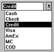

Figure 4.8 DBComboBox component
The Items property of the component specifies the items contained in the drop-down list. Use the String List Editor to specify the values for the drop-down list.
At run time, the user can choose an item from the list or (depending on the value of the Style property) type in a different entry. When the component is linked to a columnthrough its DataField property, it displays the value in the current row, regardless of whether it appears in the Items list.
The following properties determine how the Items list is displayed at run time:
1. Style determines the display style of the component:
ü csDropDown (default): Displays a drop-down list with an edit box in which theuser can enter text. All items are strings and have the same height.
ü csSimple: Displays the Items list at all times instead of in a drop-down list. All itemsare strings and have the same height.
ü csDropDownList: Displays a drop-down list and edit box, but the user cannot enteror change values that are not in the drop-down list at run time.
ü csOwnerDrawFixed and csOwnerDrawVariable: Allows the items list to displayvalues other than strings (for example, bitmaps). For more information, see the online VCL reference.
2. DropDownCount: the maximum number of items displayed in the list. If the numberof Items is greater than DropDownCount, the user can scroll the list. If the number of Items is less than DropDownCount, the list will be just large enough to display all theItems.
3. ItemHeight: The height of each item when style is csOwnerDrawFixed.
4. Sorted: If True, then the Items list will be displayed in alphabetical order.
TDBListBox

TDBListBox is functionally the same as TDBComboBox, but instead of a drop-down list, itdisplays a scrollable list of available choices. When the user selects a value at run time, the component is assigned that value. Unlike TDBComboBox, the user cannot type in an entry that is not in the list.
Here is an example of how a TDBListBox component appears at run time.

Figure 4.9 TDBListBox component
While navigating through a dataset, a TDBListBox component displays values in the column by highlighting the corresponding entry in its list. If the current row’s value is not defined in the Items property, no value is highlighted in the TDBListBox. Changing the selection changes the underlying value in the database column and is equivalent to typing a value in a TDBEdit component.
The IntegralHeight property controls the way the list box is displayed. If IntegralHeight is True (the default), the bottom of the list box moves up to the bottom of the last completely-displayed item in the list. If IntegralHeight is False, the bottom of the list box is determined by the ItemHeight property, and the bottom item might not be completely displayed.
Дата добавления: 2015-10-23; просмотров: 122 | Нарушение авторских прав
| <== предыдущая страница | | | следующая страница ==> |
| Lecture 19. Using Data Controls | | | Lecture 22. TDBLookupCombo |