The advertising industry should be driving the sustainability conversation
Can advertising be a force for good? Tim Lindsay says it can, but it needs new tools, strategies and the time to do it
Spare some sympathy for the poor, beleaguered advertising industry? Thought not. But ad agencies are under pressure, and it's a problem – or at least a wasted opportunity – that needs to be addressed.
The business world pretty much agrees that it has to behave more ethically, more sustainably, with more concern for the social and cultural outcomes from its activities. And it doesn't really matter what the motivation for this improved behaviour is – a genuine concern for the fate of the planet or a cynical hunch that doing the right thing will drive growth and profit – if the improved behavior is real. In fact, many would argue that the move to "doing well by doing good" will only become truly mainstream when the corporate social responsibility agenda and the growth agenda become one and the same.
The advertising business – despite its reputation for loucheness and excess – is brilliant at one thing; persuading people to change their behaviour. Often this comes down to making consumers want product B instead of product A. But there's also a fine record of charity, NGO, health and public service work that has brought many benefits to many people.
We're in a place where major behaviour change is required; and where governments are too inert/broke/ill-intentioned/in thrall to vested interests to take effective action. Which is why business and the agencies who partner businesses to provide creativity and innovation have to take up the challenge.
To take up the challenge new vocabulary, processes and strategy tools are needed from the ad industry to help clients understand the new landscape and discover a purpose beyond profit. We need new metrics and measurement tools – and new bonus and remuneration systems to underpin them.
But here's the problem. The experts in behaviour change are under the cosh. Client company procurement departments have systematically ratcheted down agency compensation to the point where talent and resource is thin on the ground. In the past agencies habitually took new ideas and initiatives to their clients. Now, not so much. Doing the day job is hard enough. If agencies aren't getting CSR briefs from their clients and being asked to develop purposeful thinking for their brands, who are they to argue? They'd love to do more, but it doesn't pay the bills. The urgent always gets in the way of the important.
This has created a capabilities gap. There are, of course, many admirable companies operating in the CSR space, helping clients understand the issues and stumble towards solutions. But they are in the main small operations and they tend to lack the consumer understanding, brand expertise and creative firepower of the big ad agencies. In addition, they often lack the right client relationships. These conversations must happen in the offices of the CEO and CMO, not the CSR department.
If the agencies aren't initiating the CSR conversation, driving the programme, demonstrating good behaviour is also good business, illustrating the points with compelling case histories and coming to their clients with new ideas, then clients are going to look elsewhere for their needs – to the world of consultancy, design (where these issues have been thought about more deeply and for longer), media and technology. At the moment, the client community is further ahead on this than its agency partners.
But the key skills, the necessary skills, the power to change human behaviour, still reside in the ad agencies. How, then to light a fire under the business, to force it to address the deficiencies and meet the needs of its clients?
The awards and creative education charity D&AD in association with social enterprise collective Swarm has recently launched Break the Silence, to encourage the ad and design industries to start the climate change conversation with their clients. And there's a cross industry group of interested planners, strategists, creatives and others that is beginning the process of identifying the skills and tools needs and trying to meet them.
But – and here's the encouraging bit – the biggest pressure is starting to come from people in the business, in particular millennials, who are often more conscious of the issues and more literate about them than their seniors. This generation understands the power of communication to be a force for good and want at least part of their professional life to be focused on the "good" part of "doing well by doing good"; social enterprise and commercial enterprise coming together in a natural and unforced way.
There's a long way to go and a lot to be done. The ad business, with strategy tools and processes that were for the most part developed in the 60s to accommodate the advent of commercial TV, is a lot closer to where it started the journey than where it needs to get to. But there's movement, in the right direction. Advertising as a powerful force for good? A growing number of people in the business want that to be the case. And that's good news, for everyone.
From geeky to groovy: the marketing of electric cars
As the market for electric cars accelerates, agencies are no longer only focusing on the environmental benefits
Electric cars have reached a tipping point – and with it, how they're being marketed. Whereas once you had models like the G-Whizz – not exactly the most stylish or aspirational car you'll ever see – the arrival of serious premium players like BMW has changed the game. For the first time we have cars which are great to drive, aesthetically pleasing, cost-effective and aspirational. The barriers that were once there for owning an electric car have all but gone.
As a result, the market is starting to take off. Last year registrations of plug-in cars and hybrid vehicles rose by 20%, and it's estimated that by 2040 virtually every new car purchased will be an electric vehicle.
Little wonder then that the government has just announced a £500m investment programme into the low-emissions vehicle industry, with around £200m allocated to extending the £5,000 grant offered to encourage more people to buy an electric or plug-in hybrid vehicle.
In the past, purchasing an electric car would have been seen as a quirky choice bought for ideological reasons. Now we have a fabulous product, so manufacturers can assure customers that they don't have to compromise. Car makers can sell the whole ownership experience, that an electric car is both a smart and sexy choice.
Take the launch campaign for the BMW i3. It had an interactive 360-degree film that gave audiences the chance to virtually test drive the vehicle. This was a confident campaign that focused on the thrill of driving the i3 rather than its more obvious environmental benefits.
Today the eco angle is really only part of the story, and indeed a manufacturer that continues to use that line in their marketing would be at risk of significantly restricting its audience base.
Premium brands have made great strides in reducing emissions, but it is the "wow factor" of the cars that will really grab the attention of a broader customer group.
The BMW i3, for example, focuses on lightweight engineering, premium sustainable materials and the pure thrill of silent acceleration. So the marketing put the audience in control. Users could have a unique, personalised experience that would entertain as well as allow them to experience the car.
The marketing sells the car positively rather than apologetically. It focuses on the pure pleasure of the driving experience rather than rational reasons why.
And other manufacturers have followed suit. Toyota's new marketing campaign highlights the "positive emotions" of driving an electric car in congested cities. Meanwhile Renault has recently picked up on the fun element by turning London into a giant Scalextric track.
It's a marked change. Car manufacturers can now feel confident about their electric vehicles and it's being reflected in everything they do. At the recent Geneva Motor Show electric cars were no longer the exception – in fact some major manufacturers devoted more than half their stand to them.
And it's not just to seem forward-thinking or indeed environmentally conscious; it's because the purchase of an electric car no longer means making some sort of sacrifice – be it cost, speed, range or driving pleasure. Now they are products that are cool, sexy and trendsetting … and what brand doesn't want to be seen as that?
It's a welcome situation that both manufacturers and marketing agencies will no doubt be eager to embrace. If it's greeted with campaigns as smart and innovative as some of those we've seen for "traditional" cars, then we could just be entering into a new landmark era of automotive advertising.
From Apple to MasterCard: seven key lessons for boosting brand value
After eight years of tracking the rise and fall of the world's biggest companies, BrandZ shares what it has learned
Smart marketers go beyond learning from competition – they examine the successes and failures of the best brands operating in different sectors.
We've been tracking brand triumphs and tribulations for the past eight years in our BrandZ Top100 Most Valuable Global Brands Ranking and it seems some universal lessons apply.
Based on the fortunes of companies such as Amazon, Vodafone, Samsung and MasterCard, our analysis has identified seven key lessons that companies can use to boost brand value.
1. You can grow brand value incredibly fast if you build it on a human truth
However, the converse is also true and brands can fall from grace equally quickly. Apple's rapid rise from number 29 in the original BrandZ Top100 in 2006, with a brand value of $16bn (£10bn), to number 1 in 2013, with a value of $185bn (£110bn), comes off the back of a universal truth that people want technology to work simply and easily. The danger is that complacency leads to a swift demise.
2. You can ride the wave in your sector, but without your own connection, you won't make it to the top
Ultimately, to be a great brand you need your own connection with consumers. As a fast follower, Samsung has risen remarkably far and fast but has yet to make the move from a very good, solid brand to a great brand. There have been flashes of marketing excellence, including the recent Oscar selfie campaign, but it has yet to unearth its own universal truth.
3. A great product alone is not enough
That's because when people make decisions about which products and services to buy they are not always rational. The gap between Apple, Samsung and many other brands in the technology sector is frankly pretty small. But, as we all know, the gap in business performance is dramatic. The magic ingredient that brands need to add to functionality and performance is brand love and an affinity with consumers. Both Apple and Samsung lead the way through meeting the needs of consumers in a meaningful way.
4. International expansion isn't the only route to growth
While crossing borders has helped many British brands gain prominence in the modern world – from HSBC to Next and Shell to Dove – it is not always the answer. Walmart's massive purchasing power hasn't ensured a smooth global expansion and its BrandZ ranking has steadily declined over the past eight years to its current position at number 18 and $36bn (£22bn). Other retail brands have been much more successful by expanding their footprint into other categories, most notably Amazon.
5. The power of reinvention is massive
Across the world, innovation has been shown to drive tremendous growth. Disruptive category-changing innovation is the spiritual heartland of Amazon, but other brands have also taken a similar path. BT has dramatically improved its brand value by moving from fixed line to broadband to entertainment player.
6. The competition (and the opportunity) isn't always obvious
In many categories the biggest threat comes from the providers of substitute products and services. The success of Visa and MasterCard is testament to their ability to think beyond the obvious. The two brands may be fierce competitors but both clearly recognise that their common enemies are cash and cheques.
7. Just because you are from one country doesn't mean you can't also be a local brand right around the world
Some of the most iconic American brands, such as McDonald's and Coca-Cola, now feel local in almost every country. McDonald's and Coca-Cola have become part of the community wherever they operate and connect via universal truths such as Coca-Cola's happiness message.
Http://www.theguardian.com/artanddesign/2014/sep/10/cnd-coca-cola-penguin-michelin-how-the-worlds-most-famous-logos-were-born
From CND to Coca-Cola: how the world's most famous logos were born
A dignified penguin, a drunk rubber man, a tree of life and a brain tonic for curing feelings of constant dread … here are the fascinating stories behind classic logos
 Michelin Man. Click here to view full poster. Image courtesy Laurence King Photograph: PR
Michelin
The aim of advertising is first to create recognition for a brand, and then, ideally, affection and loyalty. One of the best examples of this is found in a symbol that’s 116 years old: the Michelin Man, or Bibendum as he was formally known. Four years before the man made out of tyres was first drawn in 1898, the Michelin brothers – Édouard and André, of Clermont-Ferrand in France – attended the Lyon Universal Exposition. Legend has it that on seeing a pile of tyres on the Michelin stand, Edouard said to his brother: ‘Look, with arms and legs, it would make a man.’
The first iterations are shocking to modern audiences: in the early 20th century he was a sinister figure, chomping permanently on a cigar. Initially he was shown drinking champagne, reinforced with a strange tagline: “À Votre Santé: Le Pneu Michelin Boit L’Obstacle!” (The Michelin tyre drinks up obstacles!) This led to the character being known as the “road drunkard”, which would be abhorrent to any car-related company today.
 A 1970s Michelin poster. Image courtesy Laurence King
In 1920, he discarded his pince-nez and the cigar (at the dawn of the motor age, these had helped him appeal to the small, wealthy section of society that had the power to buy a car). The white tyres remained, however – an important throwback to his origins, as tyres were originally light in colour; black versions only appeared in 1912 when a preservative, carbon black, was added in the manufacturing process. By the 50s he had become rotund, and 20 years later had become a true cartoon, in one iteration dancing euphorically below the slogan: “I’m clinging in the rain.”
Heritage has played a big part in his success story. As design historian Alain Weill says: “Once a character becomes a popular icon, you don’t have to question if it’s good or bad. At different points Michelin stopped using him, but they always came back. He has lasted so long because the brand did.”
British Rail
 A British Rail travel centre in 1964. Image courtesy Laurence King
Arrows of indecision. Barbed wire. Crow’s feet. In the 50 years since he drew up one of the UK’s most recognisable symbols, designer Gerry Barney has probably heard them all – but he doesn’t mind.
The story of the British Rail symbol began in 1960 when a 21-year-old Barney successfully applied for a job as a lettering artist at the prestigious Design Research Unit (DRU) in London. He sketched his idea for the British Rail brief “on the back of an envelope” while taking the Tube to work. “When I got to the office I drew it up,” he says. “It was exactly how I drew it the first time … I just had to formalise it.”
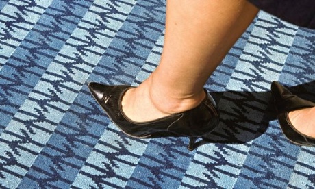 A British Rail blue carpet, 1964. Image courtesy Laurence King
DRU produced 50 different symbols and taped them to the studio walls to share with the head of the company, the director of industrial design for the railways and the British Railway Board’s design panel … this eventually came down to two: a design of two circles and an arrow, by Collis Clements, and Barney’s symbol. “Arrows were in fashion,” he recalls. But in an interesting twist, Clements’s design was leaked to the press and subsequently abandoned. That left only one. “It worked because it was obvious,” says Barney. “When you think of railways, you think of parallel lines … there was a certain logic to the way it looked, then it was a question of stylisation. I’m proud it’s lasted so long. And I’ve never thought, ‘I wish I could do it again because I’d do it better.’ I actually wouldn’t know what to do.” Fifty years on, those arrows seem far from indecisive.
Penguin
 The Penguin logo in an early paperback. Image courtesy Laurence King
Edward Young was 21 when he was dispatched to London Zoo by his publisher employer, The Bodley Head, to make sketches of penguins. In 1935, the managing director Allen Lane had hit upon the idea of producing a new range of affordable paperback books, inspired by the lack of reading material available one day as he waited for a train.
He decided on the name Penguin Books at the suggestion of his secretary, and when he left to launch the imprint, required a “dignified but flippant” symbol. Young returned from the zoo with a bunch of drawings and the observation: “My God, how those birds stink!” When Lane finally brought the sixpenny Penguins into the world, they bore the logo that would last until 1949, when it was refined to become the one we know today.
Young worked at Penguin for just four years, and in that time contributed not only the company’s inaugural logo but also its famous banded colourways: orange for novels, green for crime and pale blue for the Pelican educational series. The second world war would take Young to Russia, the Mediterranean and Australia on various Royal Navy submarines, where he reached the rank of Commander. In 1954, Penguin published his wartime memoir One of Our Submarines as its 1,000th paperback. He designed the cover himself.
Coca-Cola
 An early Coca-Cola advertisement. Image courtesy Laurence King
In 1886, the fledgling drinks company’s book-keeper Frank Mason Robinson penned the first version of the now legendary script, but it wasn’t registered as a trademark until January 1893. Back then, its lettering style was loosely applied; it was only in 1903 that it became the form used today.
Robinson arrived in Atlanta in 1885, where he met Dr John Pemberton, an experimental pharmacist known for concocting outlandish compounds. In May 1886, the manufacture of what would become known as Coca-Cola began. It was a syrup version of Pemberton’s older French Wine Coca product, which included fluid extracts of “coca” (cocaine) and “kola” (caffeine [from the kola nut]), plus sugar to make a formula that would later be carbonated. It was intended as a “brain tonic” that would increase intellectual capacity and cure headaches.
 1960s London, with a Coca-Cola advert at Piccadilly Circus. Image courtesy Laurence King
“It had no name in the beginning,” Robinson is quoted as saying. But then, each of the four men in the corporation submitted an idea for its name, and his was used. After one block-letter label appeared with the word kola changed to cola, the book-keeper, “with the flourish of an old-time penman” writes Atlanta historian Franklin M Garrett, “polished up his effort by designing, in flowing script, the famous trademark”. But Robinson actually declared himself “practically the originator” of the way of writing it – which suggests that others were involved, such as an engraver called Frank Ridge he is known to have worked with, whom history has written out.
CND
 The CND logo made from candles outside the Houses of Parliament. Image courtesy Laurence King Photograph: Laurence King
The CND (Campaign for Nuclear Disarmament) symbol was first brought to public attention on Easter weekend in 1958, on a march from London to Aldermaston in Berkshire, the site of the Atomic Weapons Research Establishment. Some 500 “peace signs” were held aloft by the protesters who walked the 52 miles – which suggests that organisers were aware of the need for political and visual impact.
The fact that they already had Gerald Holtom – a professional designer – on board explains the symbol’s immediate success. It showed the semaphore for the letters N and D, standing for nuclear disarmament. But it also came from a much more personal approach, as Holtom later explained: “I was in despair. Deep despair. I drew myself... an individual in despair, with hands palm outstretched outwards and downwards. I formalised the drawing into a line and put a circle around it. It was ridiculous at first and such a puny thing.”
He turned the design into a badge: “I made a drawing of it the size of a sixpence then pinned it on the lapel of my jacket and forgot it. In the evening I went to the post office and the girl behind the counter asked what it was. I felt rather strange and uneasy. ‘Oh, that’s the new peace symbol.’ ‘How interesting, are there more of them?’ she replied. ‘No, only one, but I expect there will be quite a lot before long.’” The symbol became more formalised as its usage became more widespread. The earliest images reproduce the submissive “individual in despair” more clearly, with lines that widen out as they meet the circle where a head, feet and outstretched arms might be. But by the early 60s, the lines had thickened and straightened out in a bolder incarnation.
In the UK it has remained the logo of the CND since the late 1950s, but internationally it has taken on a broader message signifying peace. Shortly before the Aldermaston march, Holtom had a “revolution of thought” and realised that if he inverted the symbol it could represent the tree of life, a symbol of hope and resurrection for Christians... and that the flipped image of a figure with arms outstretched upwards was also the semaphore signal for U – unilateral. Holtom’s ultimate aim had been to instigate positive change – something the CND and peace movement continues to do internationally.
http://www.theguardian.com/small-business-network/2013/oct/31/marketing-pr-business-growth
Дата добавления: 2015-10-29; просмотров: 127 | Нарушение авторских прав
| <== предыдущая страница | | | следующая страница ==> |
| COMPLEMENTARY INFORMATION | | | Bring the noise: the best marketing and PR for business growth |