Читайте также:
|
| T |
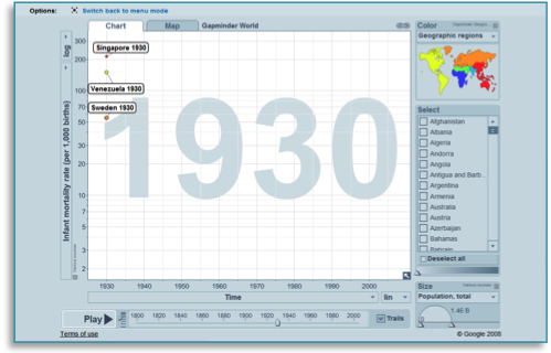
he quiz is based on the interactive and animated bubble graph called Gapminder World. The figure on the next page explains how you use Gapminder World. The graph is available on-line at www.gapminder.org/world. However, for each quiz (on the following pages) you find a link to the graph in which the graph has been adjusted to fit the quiz.
If you have problems in following links in the quizzes you can adjust the graph manually. Open one graph for each quiz question and:
· Select “time” for the x-axis
· Make sure the trails-box is tick-marked
· Make the adjustments described for the quiz in question
· Once you selected some bubbles: Pull the opacity bar to the left so that only the selected bubbles are visible.
A screen cast of the quiz graph of quiz 1, as it look when you ask the quiz question.
| Click here if you are using the graph in a lecture. The graph will cover the whole screen. |
| Click here to get a short link to the specific graph you have created. |
| Click here for a short tutorial video. |
| Select between Chart and Map view. |
| To reload the default graph click the ”Gapminder World” heading at the top of the page (not shown here). |
| Click here to open a tool that help you zoom in or out. Click 100% to see the whole graph again. |
| If you want information about the sources you can click on the small text next to the axis. |
| Click here to select indicators for the y axis. |
| Hover your mouse over the bubble to reveal the names of the countries. |
| The size of the bubble normally represents the population of the country. Click here to make the size proportional to another indicator. |
| Click Trails to track a selected country while an animation plays. |
| Change the size of the bubbles here. |
| Remove all countries other than those selected here. |
| Deselect all countries here. |
| Select individual countries here by clicking the boxes. You can also click on the bubbles. |
| The countries on the graph are colour coded by continent. Here you can choose to colour code them by other indicators. |
| Adapted from an original idea by wwww.juicygeography.co.uk |
| Watch the graph change over time by using these buttons. |
| Both the x and y axis scales can be linear or logarithmic. Choosing a log scale may make it easier to see the trends on the graph. |
| Click here to select indicators for the x axis. You can also choose to display time on this axis. |
| Change the speed of the graph here. |
 About the data
| T |
he data in the quizzes are compiled from a variety of sources. Data from high-income countries are mainly from registers, whereas surveys are a common source in low- and middle-income countries. Such surveys are based on interviews with a representative sample of the population.
The sources for the data can be found by clicking on the small name-tag next to the axis, as shown in the screen cast to the right. You can also look under “data” on our homepage.
Sometimes the data display a straight line for a few years. This is due to rounding. Yearly fluctuations in the data are often smoothed out in many sources. Hence, temporary crisis are not always clearly visible.
The uncertainty of the data varies, but there is a consensus regarding the general trends displayed.
Many graphs use a so-called log-scale, which expand the scale at low values and compress the scale at high values. This does not affect the answers. The log scale gives a more correct picture in many cases.
For example, 100 extra dollars per year makes a huge difference for a person earning 400$. The same 100$ addition might not even be noticed by someone earning a 100.000$.
Many countries had different borders or did not exist at all in the past. The data concerns the area of the present day borders of the country.
Produced by Gapminder. Version: 2010-03-22
 You are free to use and distribute this material
under a creative commons licence. We ask you to
credit Gapminder as the source.
You are free to use and distribute this material
under a creative commons licence. We ask you to
credit Gapminder as the source.
|
| Cover photo: Helen Rikard www.flickr.com/people/pikaluk/ More teaching materials available at www.gapminder.org/for-teachers/ |
A screen cast of a part of the quiz graph.
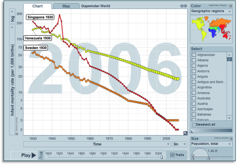
| The Quiz Ask the students: Which country has today the lowest death rate during the 1st year of life (i.e. infant mortality): Singapore, Sweden or Venezuela? Answer: Singapore |
| The quiz graph Link to quiz graph: http://tinyurl.com/gapquiz01 Or adjust the graph manually: · For Y-axis select: “Infant mortality rate (per 1,000 births)” · Select Singapore, Sweden and Venezuela · Pull back the time bar to 1930 |
If students ask
Singapore in 1930 was still a British colony. The infant mortality was four times as high as in Sweden. Since well before that year Venezuela had been an independent nation and was already a major exporter of oil.
World War 2: Singapore was occupied by Japan and the population suffered severely from the war. The war had minor effects on the health of children in Sweden and Venezuela.
After the war: Singapore quickly regained its pre-war health.
1950s and onwards: economic development and health improvements were fast in Sweden and even faster in Singapore.
In the 1990s: Singapore becomes richer than Sweden. Infant mortality becomes lower in Singapore around the year 2000.
Singapore had high economic growth, high and effective investments in health and also benefited from being a compact city state. The health improvements were part of a global pattern of improving health.
The Quiz
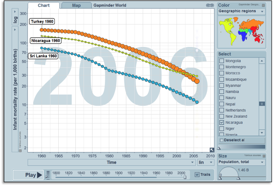
Ask the students: Which country has the lowest infant mortality today: Nicaragua, Sri Lanka or Turkey?
Answer: Sri Lanka
The quiz graph
Link to quiz graph: http://tinyurl.com/gapquiz02
Or adjust the graph manually:
· For Y-axis select: “Infant mortality rate (per 1,000 births)”
· Select Sri Lanka and Turkey
· Pull back the time bar to 1960
| If students ask Nicaragua, Sri Lanka and Turkey are all middle income countries that have made significant progress in the areas of health and economics. Sri Lanka, however, has had better health than the other two countries for many years. This is partly due to widespread literacy and access to health care. |
The Quiz
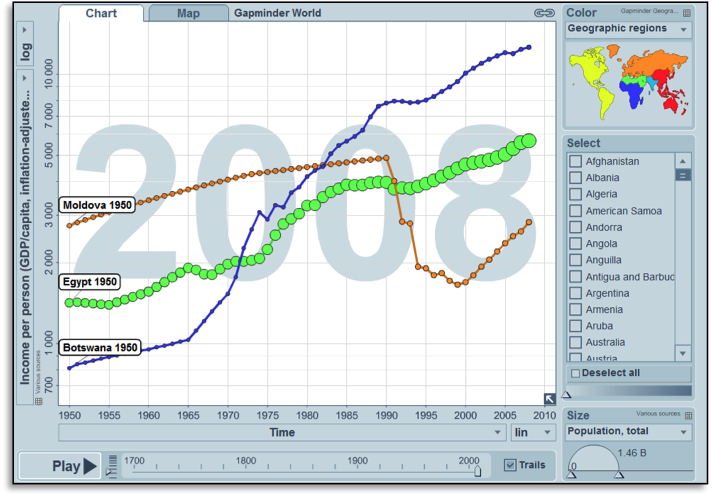
Ask the students: In which country is the average income per person highest today: Botswana, Egypt or Moldova?
Answer: Botswana
The quiz graph
Link to quiz graph: http://tinyurl.com/gapquiz03
Or adjust the graph manually:
· For Y-axis select: “Income per person (GDP/capita, inflation adjusted $)”
· Select Botswana, Egypt and Moldova
· Pull back the time bar to 1950
| If students ask Botswana experienced a slow, but positive, progress as an English colony. They became independent in 1966 and has since been a stable democracy. Well-managed diamond mines have given the country one of the highest economic growth rates in the world and made it one of the wealthiest countries in Africa. Egypt before 1954 was a semi-democracy, constrained by British colonial interventions. Attempts to industrialise were not very successful. In 1954 the military took power in a coup. From the 1960s and onwards the economy has progressed. Moldova was one of the Soviet Republics up to 1991. At independence the economy collapsed, but it is now slowly recovering. The indicator “Income per person” is the same as GDP per capita. We call it “income” in Gapminder World to make it easier to understand. The “income per person” has been adjusted for inflation and for differences in living costs across countries. The adjustment for living costs is based on so-called purchasing power parities. The income per person in a county cannot be much lower than $300 US per year for any longer time. The reason is that below that level of income almost everyone would be starving to death. Hence, the $800 US per person that people in Botswana had in 1950 was a very low income. |
The Quiz
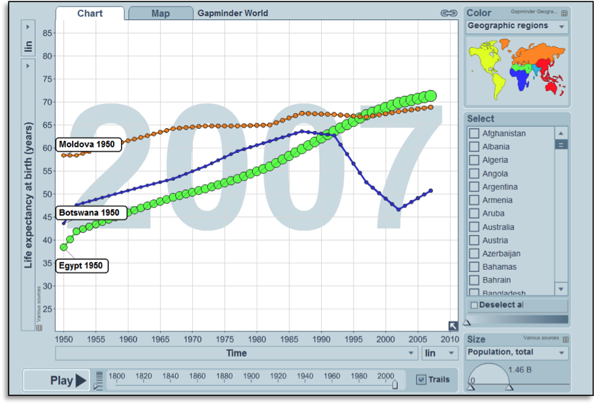
Ask the students: In which country do people live the longest on average today: Botswana, Egypt or Moldova?
Answer: Egypt
Do this quiz directly after quiz 3. You can use this quiz to contrast the economic success of Botswana with their HIV/AIDS problems.
The quiz graph
Link to quiz graph: http://tinyurl.com/gapquiz04
Or adjust the graph manually:
· For Y-axis select: “Life expectancy at birth (years)”
· Select Botswana, Egypt and Moldova
· Pull back the time bar to 1950
| If students ask Egypt has made continuous improvements in health. Fairly good economic growth is part of the explanation. Furthermore, more and more people have clean water to drink and foreign aid has helped to fund vaccination and healthcare throughout the country. They have also eradicated malaria. Moldova started off quite well, but has only made slow progress during recent years due to many economic and social problems. The economic collapse after independence in 1991 is a major explanation for this. Botswana initially made good progress in health, based on good economic growth and a well functioning government. In the 1980s, however, the HIV/AIDS epidemics hit the country hard. Treatment for AIDS has become available, but the country still has high transmission of HIV. |
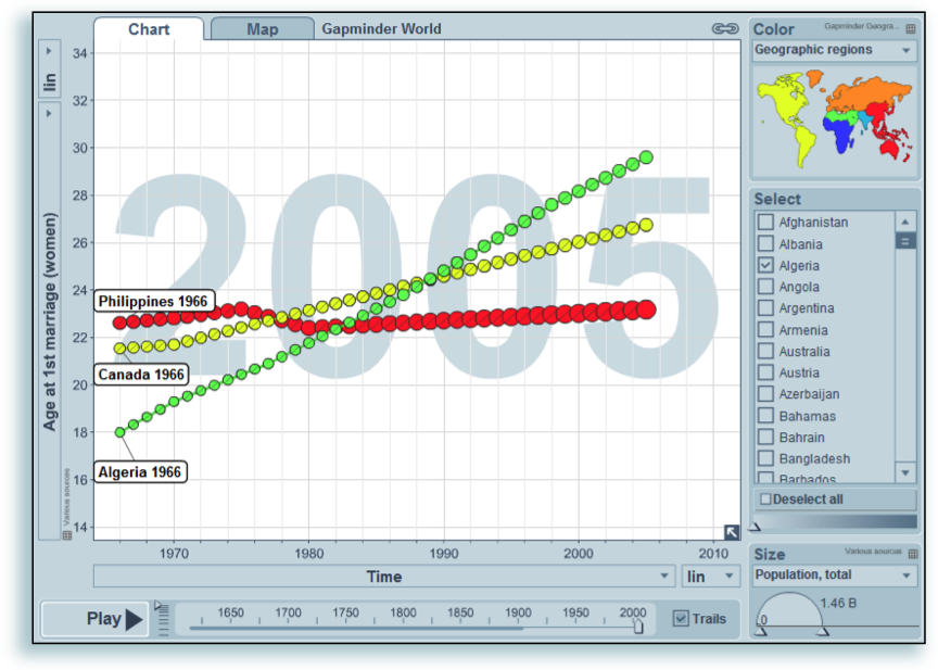
The Quiz
Ask the students: In which country today do women on average marry at the oldest age: Algeria, Canada or the Philippines?
Answer: Algeria
The quiz graph
Link to quiz graph: http://tinyurl.com/gapquiz05
Or adjust the graph manually:
· For Y-axis select: “Age at 1st marriage (women)”
· Select Algeria, Canada and the Philippines
· Pull back the time bar to 1966
| If students ask Girls in Canada, like in most western countries, historically married at a relative high age. However, the age at marriage was at an all-time low in the decades after World War II. Canadian women have since reverted back to a higher age at marriage in the last decade. In Algeria girls used to marry at a relative young. In the 1960s Algerian women started to marry at an increasingly higher age. This happened partly because it became the norm across the Arab world that a couple should have their own home. This meant that they had to save for a long time before they could get married. Another factor was the longer time girls spent in school. In the Philippines the age at marriage have not changed much in the last 50 years. |
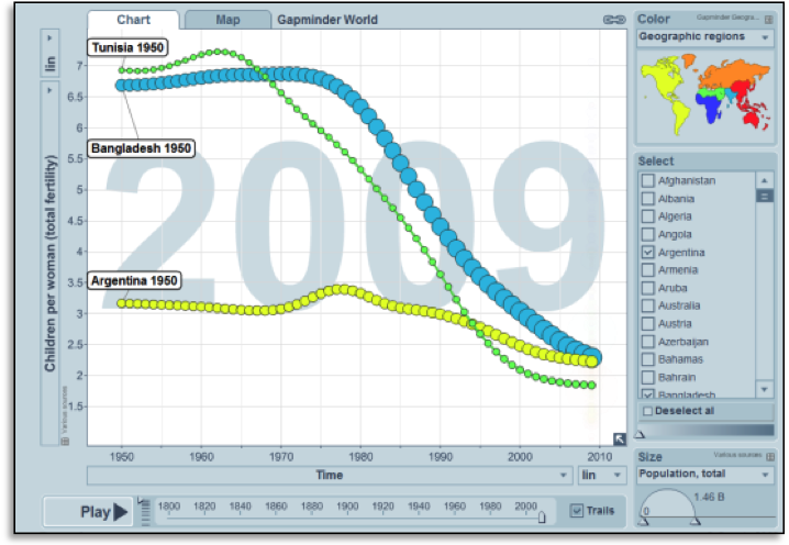
The Quiz
Ask the students: Which country has the fewest number of children per woman today: Tunisia, Bangladesh or Argentina?
Answer: Tunisia
The quiz graph
Link to quiz graph: http://tinyurl.com/gapquiz06
Or adjust the graph manually:
· For Y-axis select: “Children per women (total fertility)”
· Select Argentina, Bangladesh and Tunisia
· Pull back the time bar to 1950
| If students ask Argentina, in 1950, had already changed to small families and women, on average, had a bit more than three children per woman. The number of children per woman has decreased further in the last decades. In Bangladesh in 1950 girls married very early, had few rights and gave birth to an average of 6 to children. In the 1980s Bangladesh initiated an effective family planning program. Female family planners reached out to women in their homes and family planning services were provided in rural areas. Political and religious leaders supported the idea of small families. Together these actions helped to decrease the fertility rate very fast, even though the improvements for women have been relatively limited. In Tunisia in 1950 girls married relative young and had many children. In the 1960s Tunisian women gradually started to marry at a higher age. This happened partly because it became the norm across the Arab world that a couple should have their own home. This meant that they had to save for a long time before they could get married. Another factor was the longer time girls spent in school. In the 1980s family planning services started to have an increasing impact as well, so the number of children decreased fast. |
The Quiz
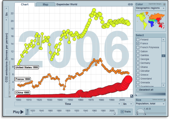
Ask the students: Which country emits most tones of CO2 per person today: China, France or USA?
Answer: the USA
The quiz graph
Link to quiz graph: http://tinyurl.com/gapquiz07
Or adjust the graph manually:
· For Y-axis select: “CO2 emissions (tonnes per person)”
· Select Argentina China, France and USA
· Pull back the time bar to 1900
| If students ask China is today the country that emits most CO2 in total, but that is because it has such a large population. Each American still emits almost four times as many tonnes CO2 as each Chinese person do. In 1900 China emitted negligible amounts of CO2 per person and it increased very slowly. From the 1970s, the emissions had started to grow faster, as economic growth accelerated. The US and France were both industrialised by 1900. Various energy sources were more readily available in the US than in France. Hence, the energy system was more energy intensive from an early date in the US. Income per person grew strongly during the 20th century in both countries, and the CO2 emissions followed this pattern. Numerous crises affected the emission of CO2: the 1st world war (mostly in France), the depression after 1929 (with the strongest effect in the US) and the 2nd world war (mainly seen in France). In the 1970s the oil prices increased massively at two occasions. These events are known as the 1st and 2nd oil crisis. They provoked actions to use the energy more efficient and to switch to energy sources with less emission of CO2, e.g. nuclear power. Many of these changes remained even after the oil-price dropped again in the 1980s. Furthermore, the production in the high income countries became more focused on producing things that required less energy (e.g. producing medicines, just to take one example). from teh start World War one seen for France, the downturn during the depresseion is visible for both (most for the US) and the WW2 is visible for france. Oil crisis visible in the 70s, then things done. Nuclear power, especially in France. |
Дата добавления: 2015-10-29; просмотров: 225 | Нарушение авторских прав
| <== предыдущая страница | | | следующая страница ==> |
| How to set up the game | | | Биссектриса и биссектор |